")


3 Expert Tips for a Healthier Home
As an interior designer passionate about creating environments that support wellness, I’ve always believed that how a space feels is just as important as how it looks. At m studio interior design, we explore every layer that contributes to a thriving home from intentional layout and lighting to the often underestimated impact of color.
And this year, my recent trip to Salone del Mobile in Milano, Italy confirmed something I’ve long held true: color is making a quiet comeback, and it’s transforming how we feel in our spaces!!!
Wellness and the Psychology of Color
Color psychology in interior design isn’t just a trend, it’s a powerful tool that directly impacts our mental health and emotional well-being.
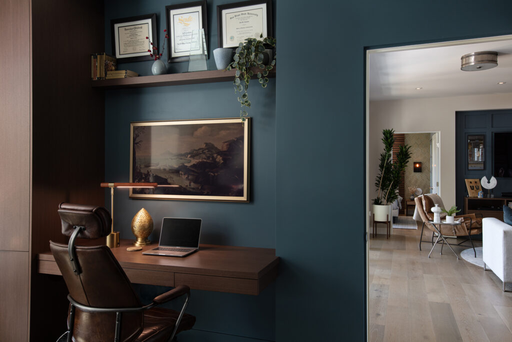
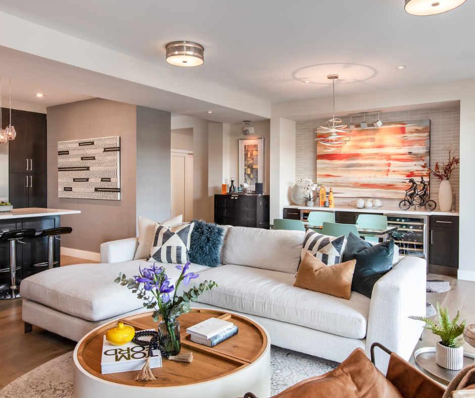
Cool tones, like blues and greens, promote calm and concentration, making them ideal for home offices and bedrooms. Warm tones, rich terracottas, ochres, ambers and soft corals, foster connection, energy, and joy in spaces like kitchens and living rooms.
In wellness-centered interior design, color goes beyond aesthetics. It supports mindfulness, influences behavior, and creates environments that feel both safe and inspiring.

A Milan Design Moment: When Color Meets Luxury
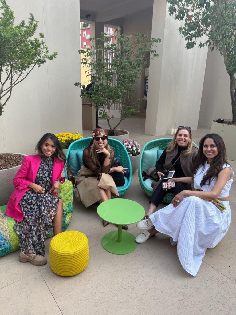
Walking through Salone del Mobile and exploring all of the delicious design showrooms scattered throughout the streets of Milano this year was nothing short of awe-inspiring!! Amidst the innovation and craftsmanship, the standout for me was the seriously fearless and refined use of color… especially from some of my favorite luxury furniture brands: Paola Lenti, Poltrona Frau and Baxter.


Paola Lenti
A new fave of mine and known for her bold, artistic use of color, Paola Lenti brought a vibrant and definitely joyful, playful energy to the show! Her collections celebrated layered hues of citrines, chartreuse and lagoon blues, paired with sculptural forms and sustainable materials (bonus!!). The result? Spaces that felt lively yet grounded, expressive yet serene.


Paola Lenti redefines color as a wellness language through texture, tone, and intentional vibrancy.
Poltrona Frau
At first step through their showroom, Poltrona Frau was such a design thrill, showcasing earthy palettes and touchable, textural fabrics from leathers to velvets in mustard velvets, rust tones and much more that were seen in their upholstery, casegoods and even closet systems!! …Pproving that vibrant tones can be both grounding and sophisticated.


A masterclass in how color and texture support wellness and warmth.
Baxter
This was probably the most exciting of the brands to explore as not only did they have their permanent showroom in Milan, but I had the privilege of visiting their villa in… Lake Como!!
Accompanying the gorgeous and absolutely breathtaking views of the lake, this brand leaned into moody jewel tones (think deep teals, hints of fuchsia and plums) offering soulful, tactile richness. Their spaces felt emotionally charged, certainly very luxurious and of course unforgettably inspirational!


Baxter’s dramatic use of color transforms furniture into emotional statements.
3 Wellness-Centered Design Tips Using Color
Inspired by what I saw in Milan, I returned to Southern California with a majorly renewed sense of possibility. Here are three powerful ways to bring wellness through color into your home:
1. Ask Yourself: How Do I Want to Feel in This Space?
Design with EMOTION as your guide. It’s very common that I’ll ask my clients how they want to feel in varying spaces. A bathroom might warrant a more tranquil environment exuding a calming sense of quietude, whereas a home bar might introduce a more vibrant palette to convey a bit of an energetic, yet ambient vibe.
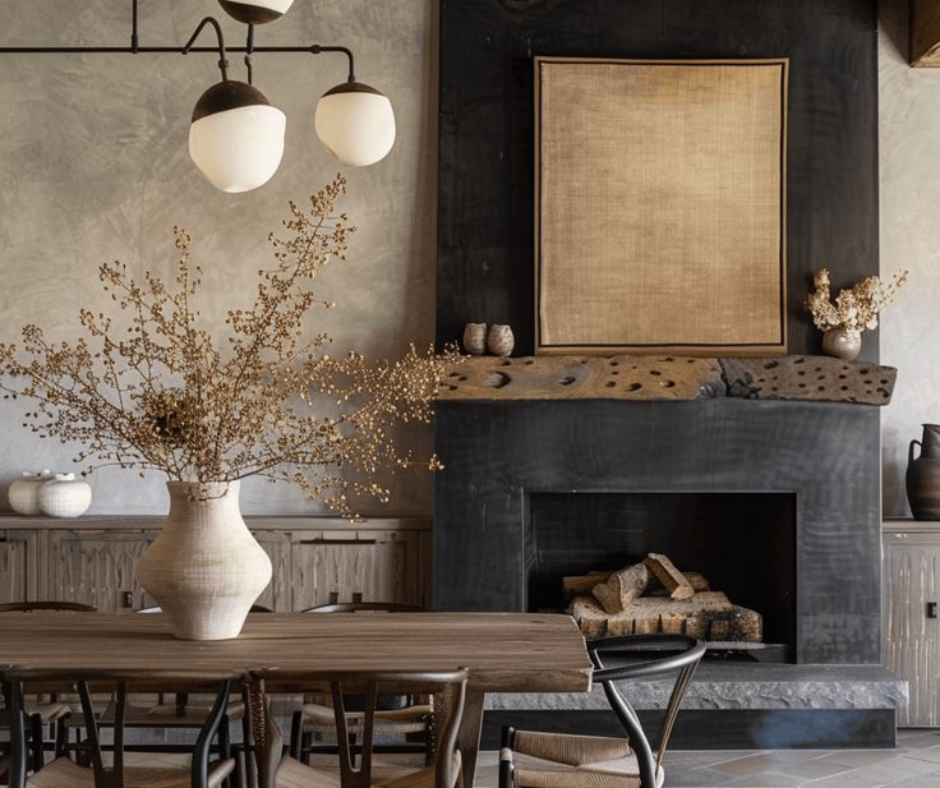
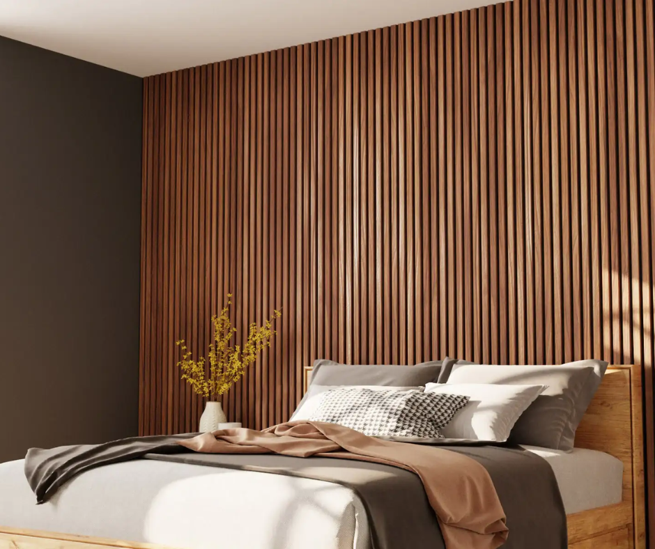
For calm and clarity (think home office or bed & bath): use hues like slate blue, greiges, or soft sage. For joy and connection (your common areas including dining or living spaces): explore clay, coral, ochre, or honeyed yellows.
2. Discover Which Colors Naturally Energize or Calm You
Not everyone responds to color the same way… some may really enjoy the use of bold colors to active an energetic space, whereas others may require soothing, softer tones to feel more relaxed when coming home. Observe your personal preferences in nature, clothing, and other spaces you enjoy outside of your home.
Ask yourself this question: Do you feel energized by sun-washed terracotta or soothed by oceanic teal? Or to put it more simply, are you into the warmer reds and oranges or align with cooler blues and greens? Use those reactions as your design compass.
3. Balance Bold Accents with Neutral Foundations
If bold color feels intimidating, start with a neutral base (soft taupe, warm white, pale grey) and build interest through layered accents.
Think POPS of color… add colorful art, pillows, one standout furniture piece, or even painted millwork for personality that can evolve with time.

Designing Wellness at Home Through Color
A well-designed space can be both emotionally uplifting as well as beautifully styled. As seen at Salone del Mobile, the future of wellness design lies in personalized color palettes and curated layers, not in limiting yourself to beige (don’t get me wrong- it’s still a great color to build on!!).
At m studio interior design, we help our clients blend high-end style with intentional living through color and wellness-driven interiors.
Let Color Work for You!
The right hues can turn your home into a restorative sanctuary, your workspace into a focus zone, and your shared spaces into areas of joyful gathering. Ready to elevate your home with intentional, wellness-driven design? Let’s start your color story together! Get in touch with us to begin your journey!!
Xoxo,
Megan


")

")

")


